Feb. 08, 2021 | Tyler Difley
True colours: Pantone's 2021 Colour of the Year and the history of a trendsetter
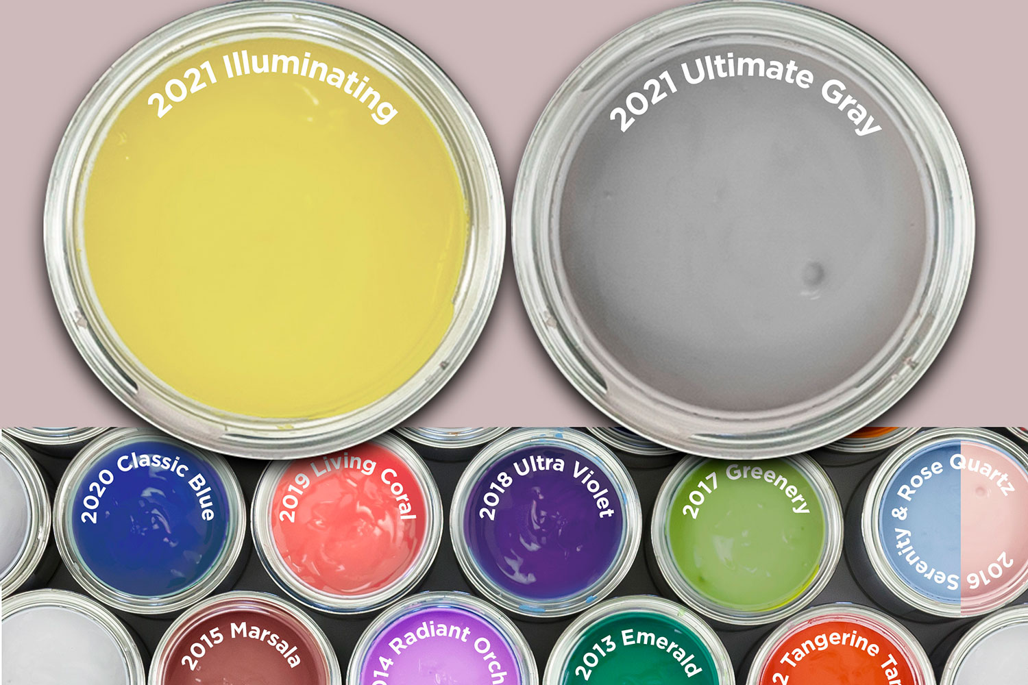
At the end of 2020, the Pantone Colour Institute announced its 2021 Colour(s) of the Year: Ultimate Gray (17-5104) and Illuminating (13-0647), "A marriage of color conveying a message of strength and hopefulness that is both enduring and uplifting."This marked only the second time in the 21-year history of Colour of the Year that Pantone has chosen two colours, a deviation from the norm meant to reflect, and move on from, a year in 2020 that was anything but normal. The combination of hues strikes a nice balance – one is grounding and soothing, while the other is optimistic and bright.
But let's back up a bit. What is Pantone? And why does the Colour of the Year matter?
Pantone developed the first colour-matching system in 1963, a boon to designers around the world. The system helps to prevent colour discrepancies in printing, providing colour certainty and consistency for a variety of products and brands. The Pantone Matching System encompasses 1,867 solid colours, each with a unique identification number. Several of these pantone colours have become famous due to their association with high-profile brands. A few trademarked examples include Tiffany Blue (1837), Barbie Pink (219), Target Red (186) and McDonald's French-Fry Gold (123).
Despite Pantone's long history, Colour of the Year only began in 2000 and the announcement didn't become a hype-generating event until 2007, when Pantone started issuing press releases to announce the new colours. Each year, experts from the Pantone Colour Institute assess influences from a variety of mediums before selecting a colour.
"This can include the entertainment industry and films in production, traveling art collections and new artists, fashion, all areas of design, popular travel destinations, as well as new lifestyles, playstyles, and socio-economic conditions," according to Pantone's website.
"Influences may also stem from new technologies, materials, textures, and effects that impact colour, relevant social media platforms and even upcoming sporting events that capture worldwide attention."
Pantone's choice for the upcoming year, announced in early December, is seen as a major trendsetter for a variety of creative industries, including interior design and décor.
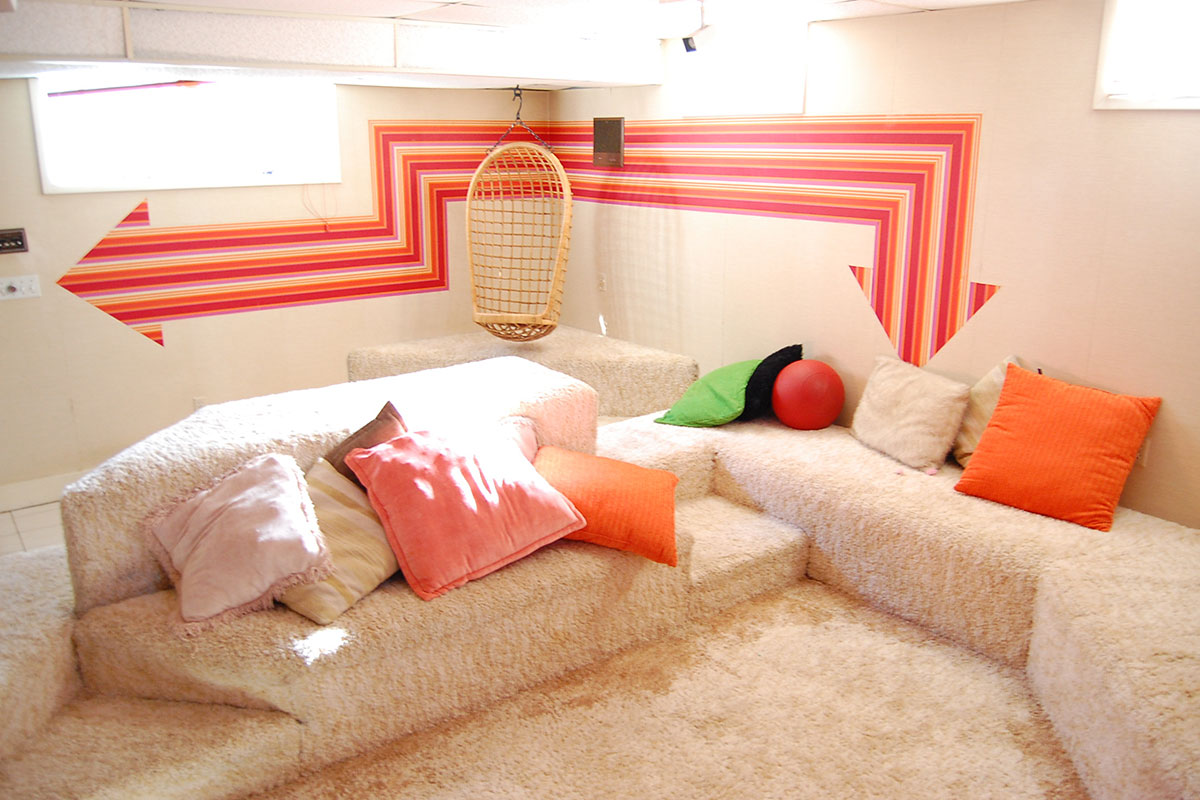
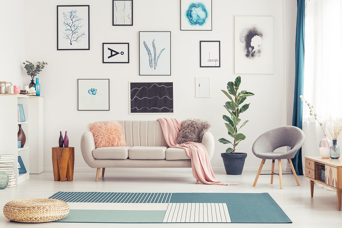
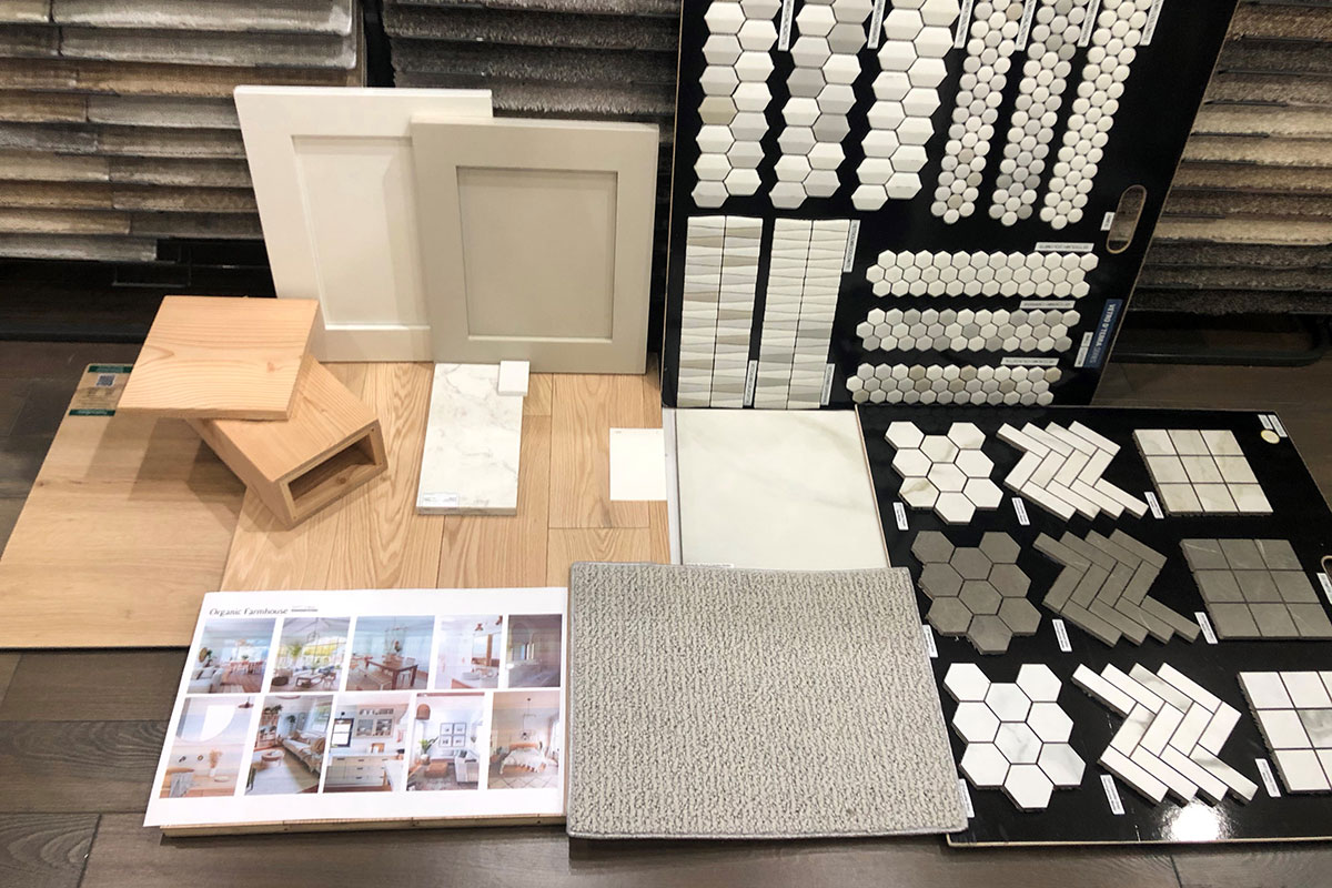
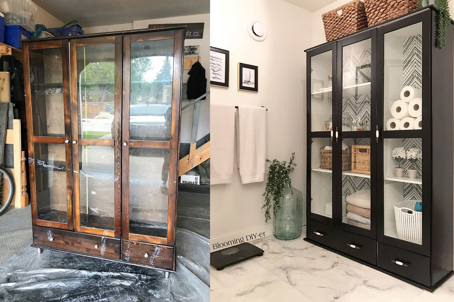
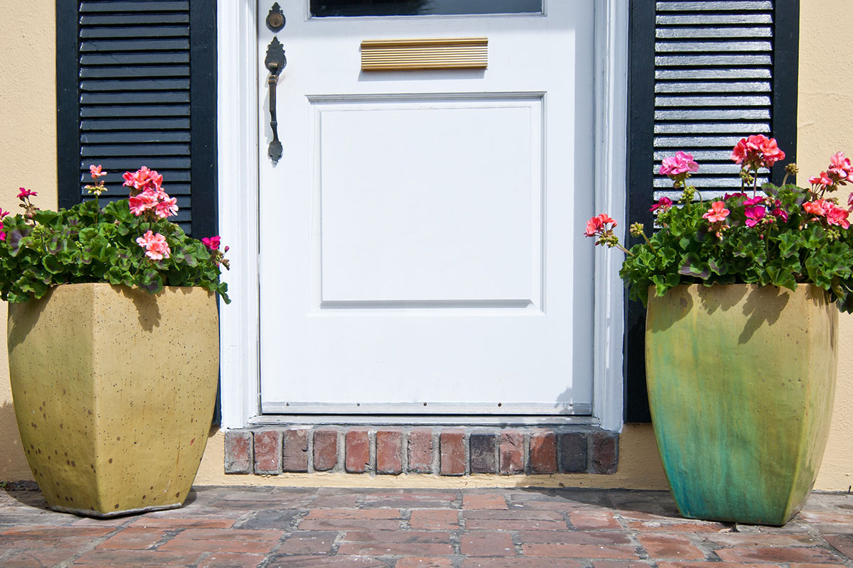
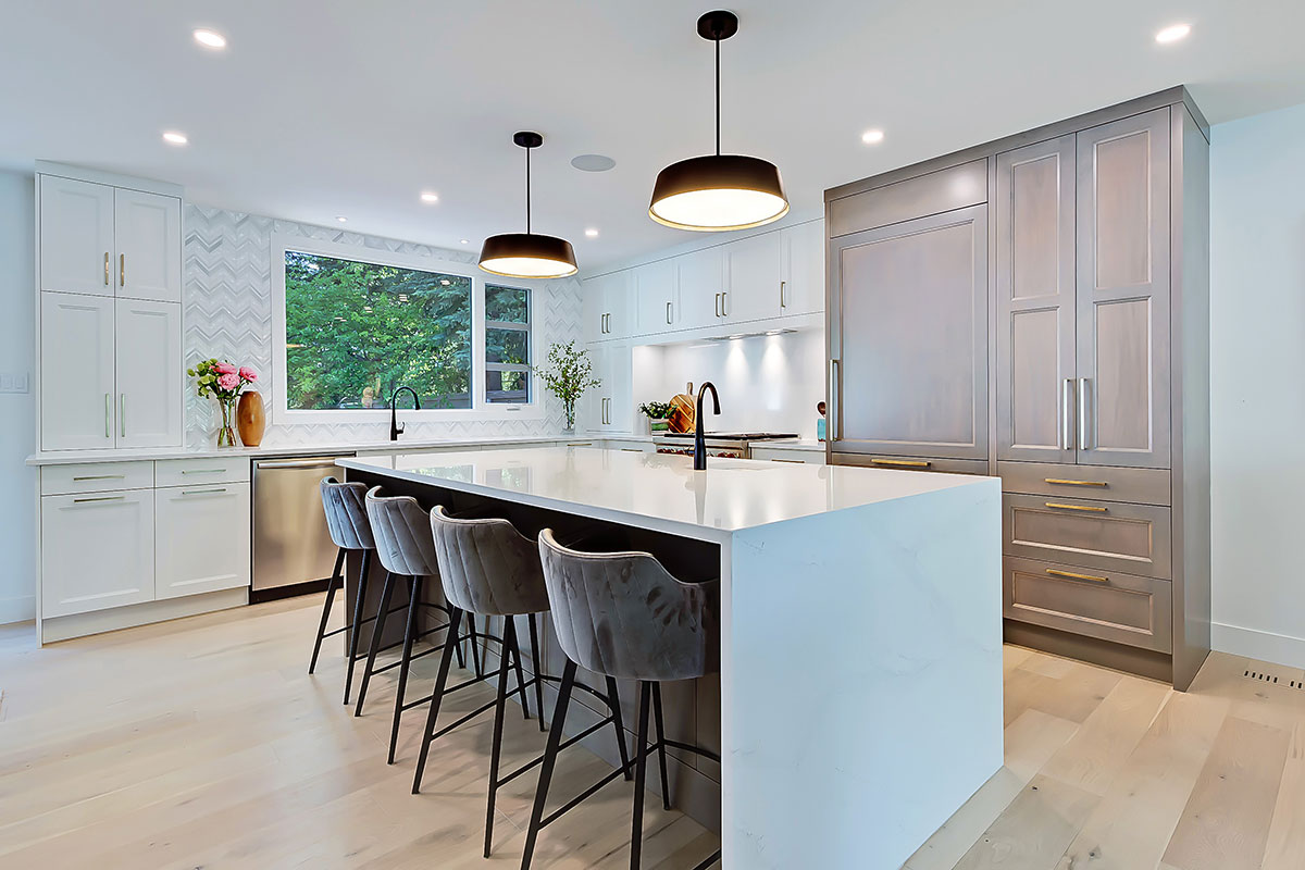
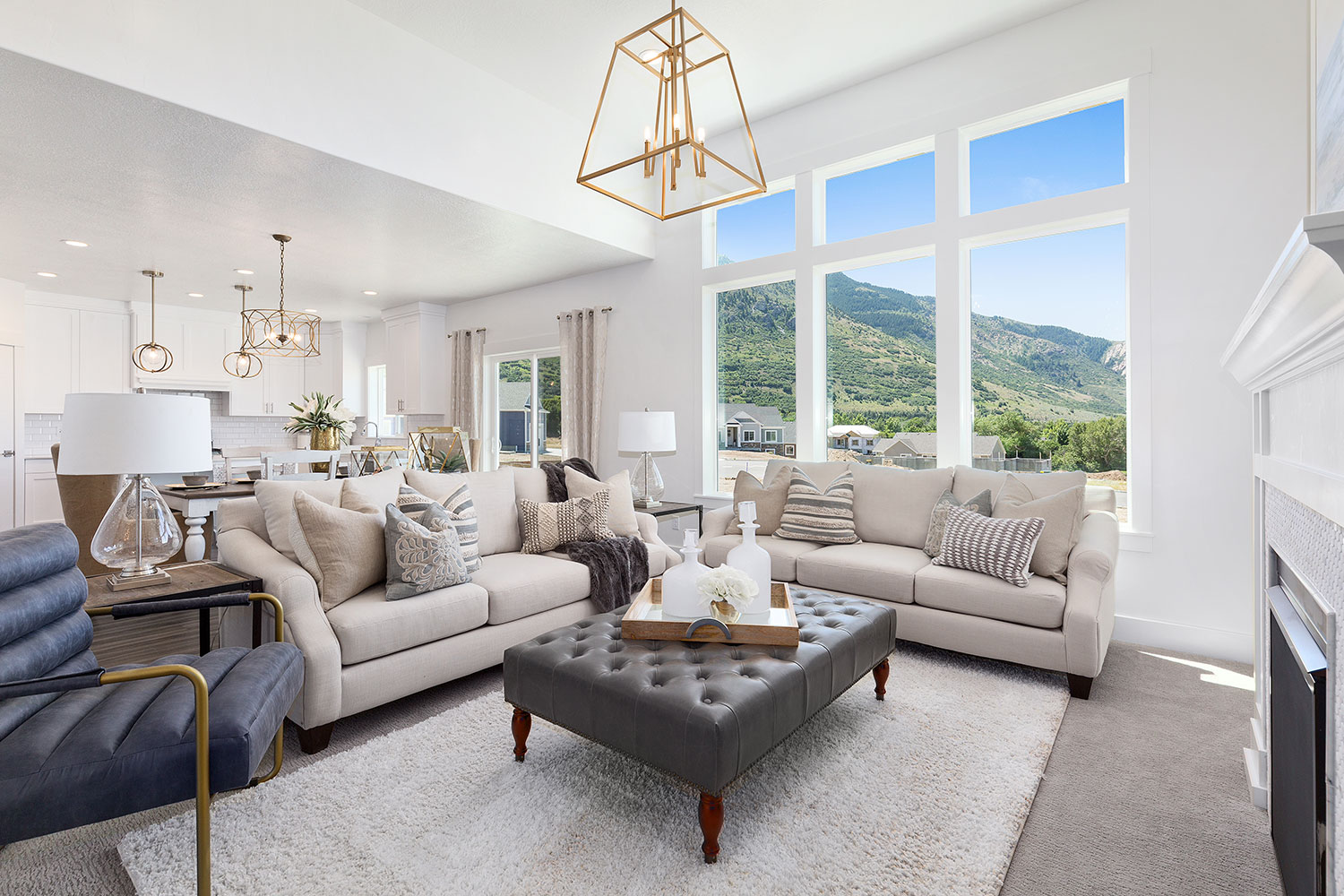
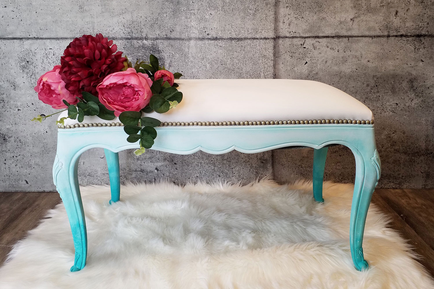
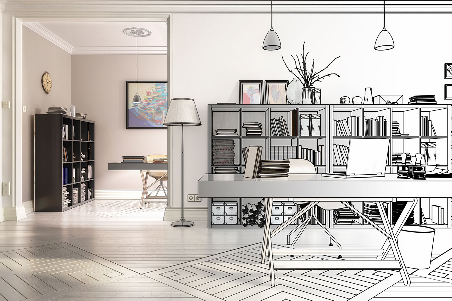
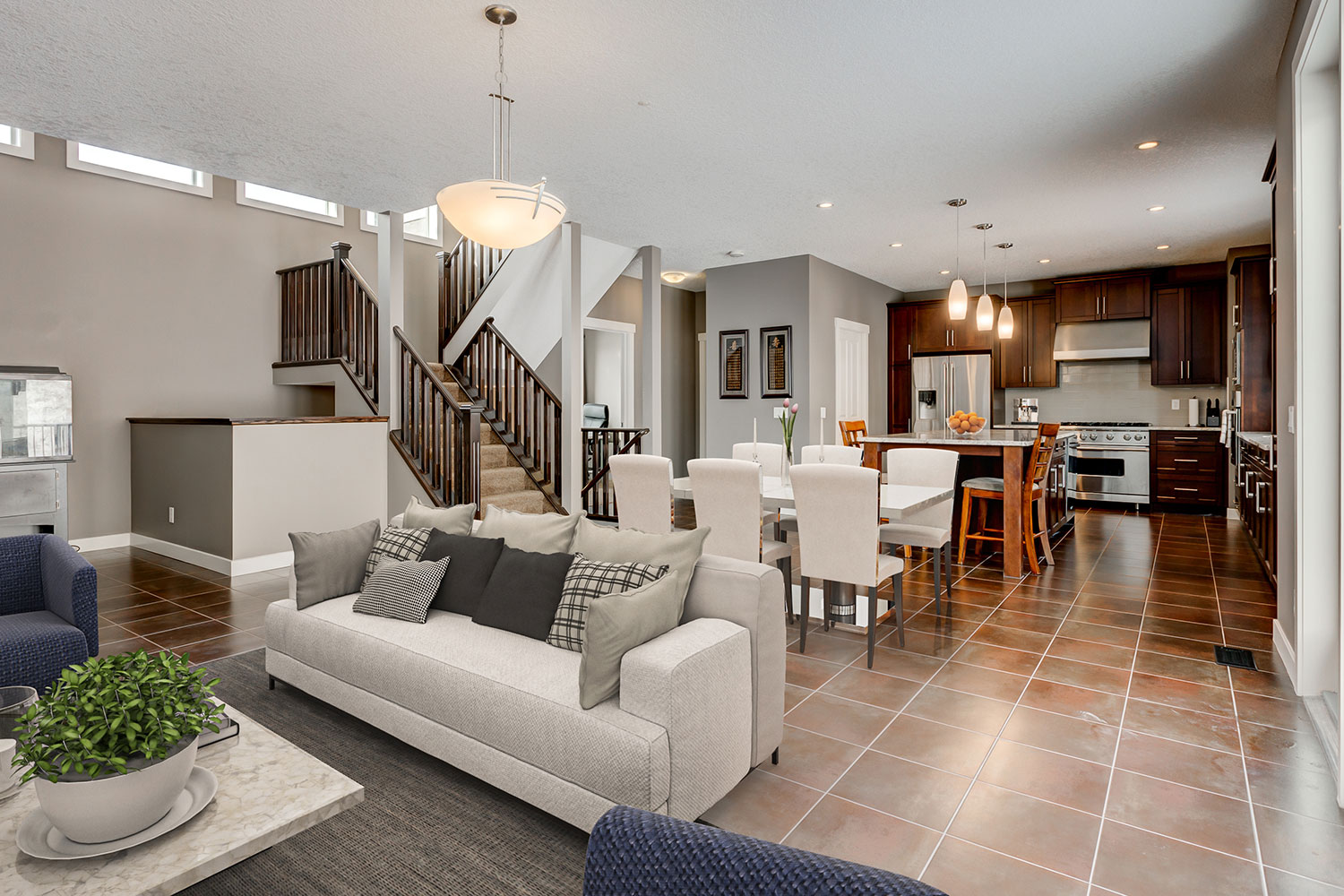
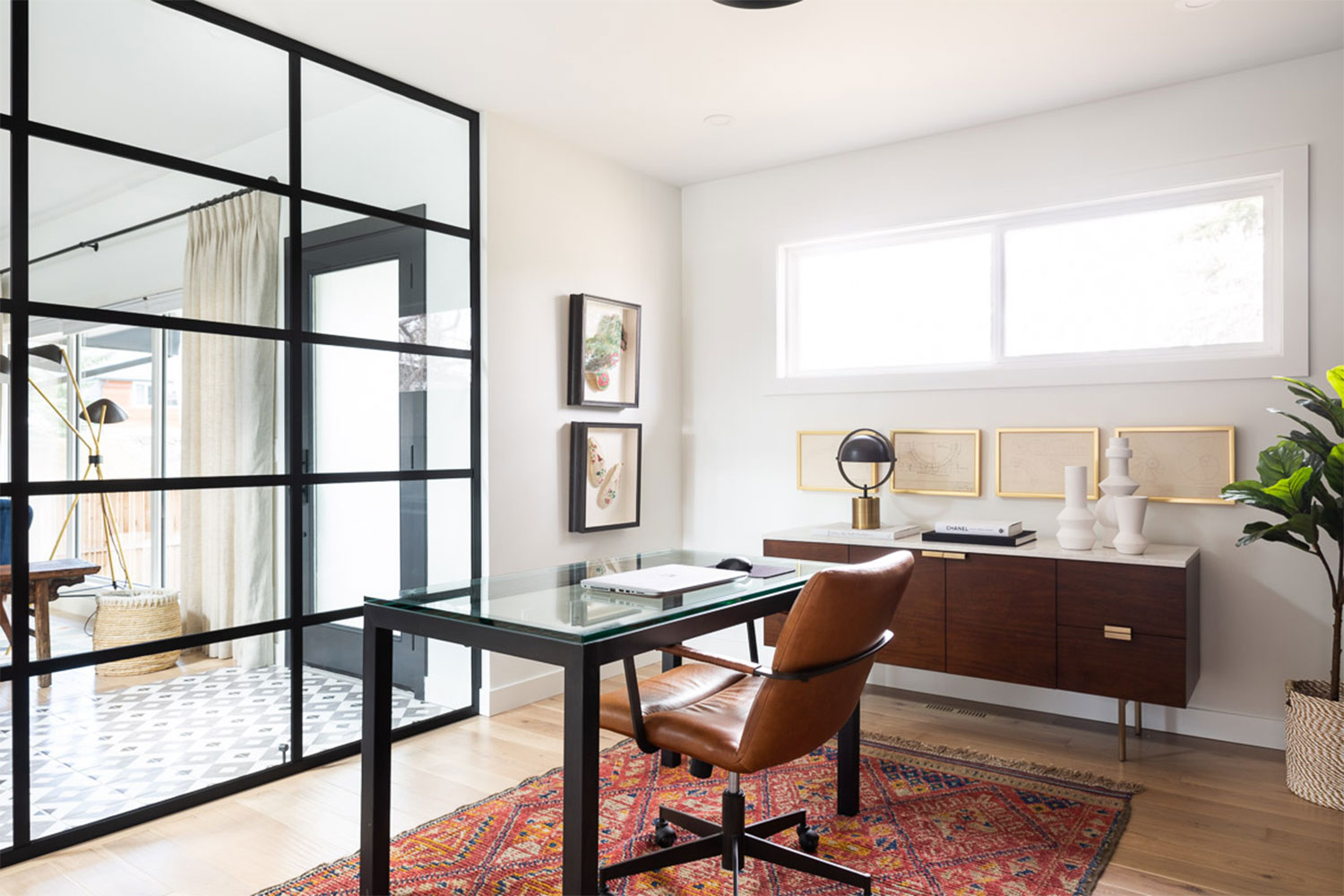
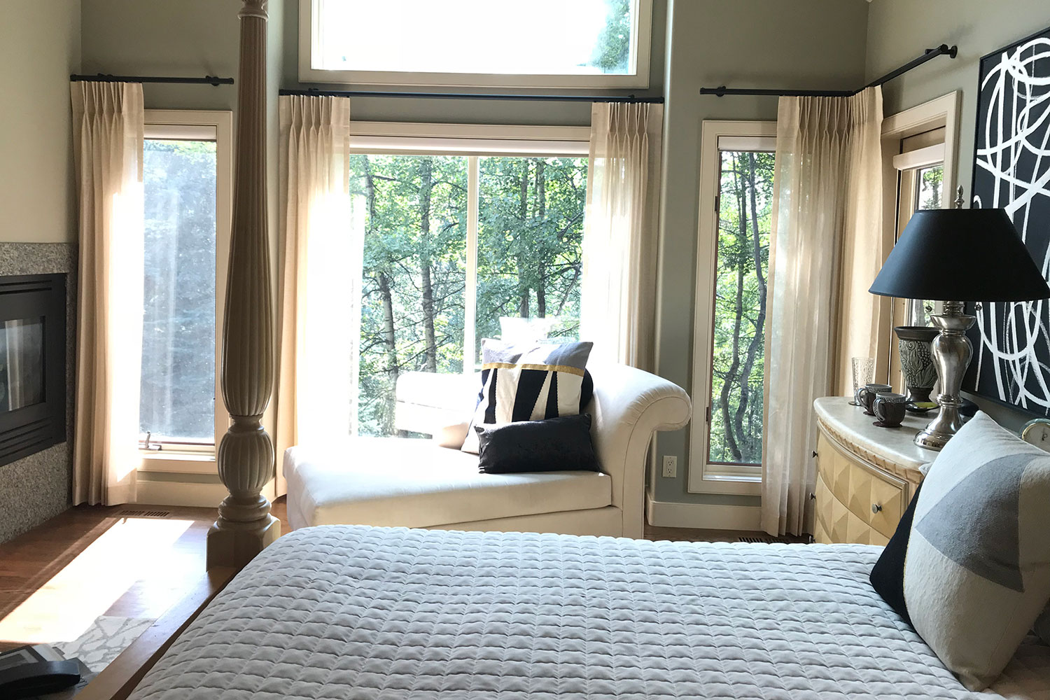
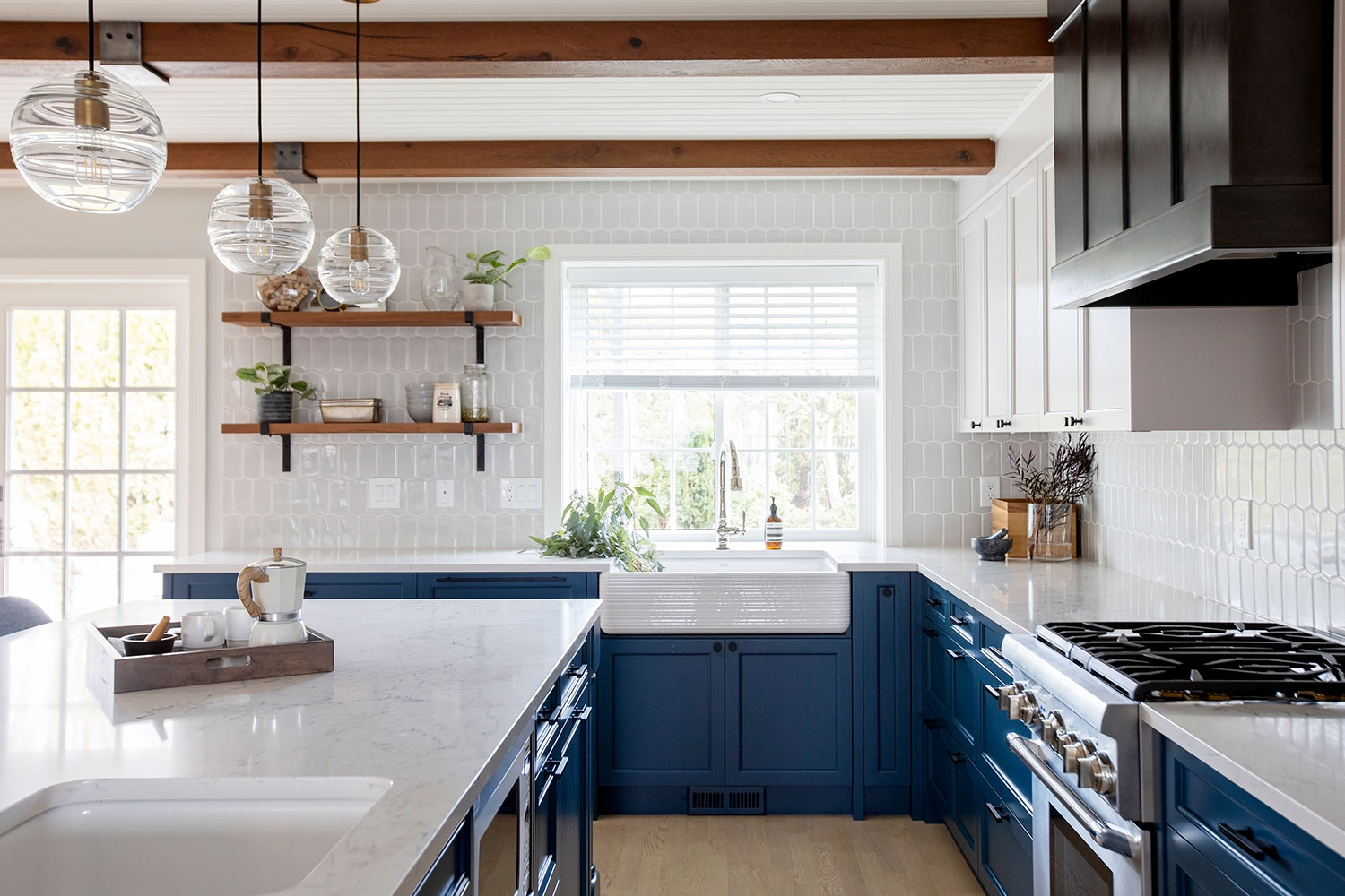
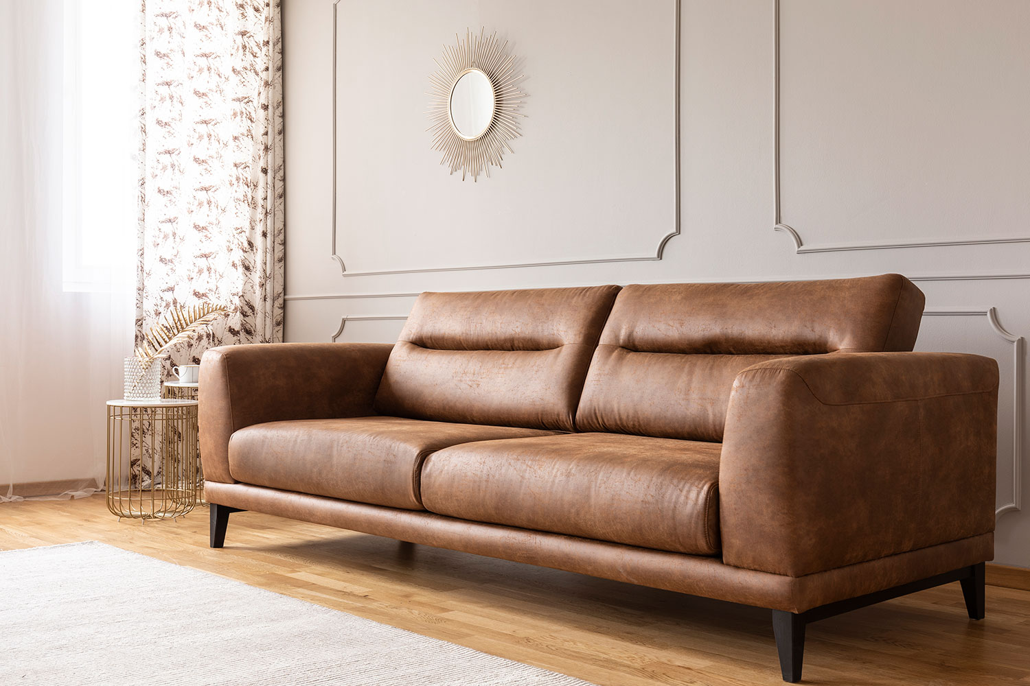
There are many ways, big and small, to incorporate Pantone's 2021 colour selections into your home. You could mix up the overall aesthetic with a fresh coat of paint in the Pantone colours, or add some furniture, art or accessories that showcase the 2021 selections. If you don't know where to start, IKEA published its own trend report featuring the 2021 colours, which is full of possibilities.
If this year's "trendy" colours aren't really your style, there's plenty of additional inspiration to be found in the last 20 years of Pantone selections:
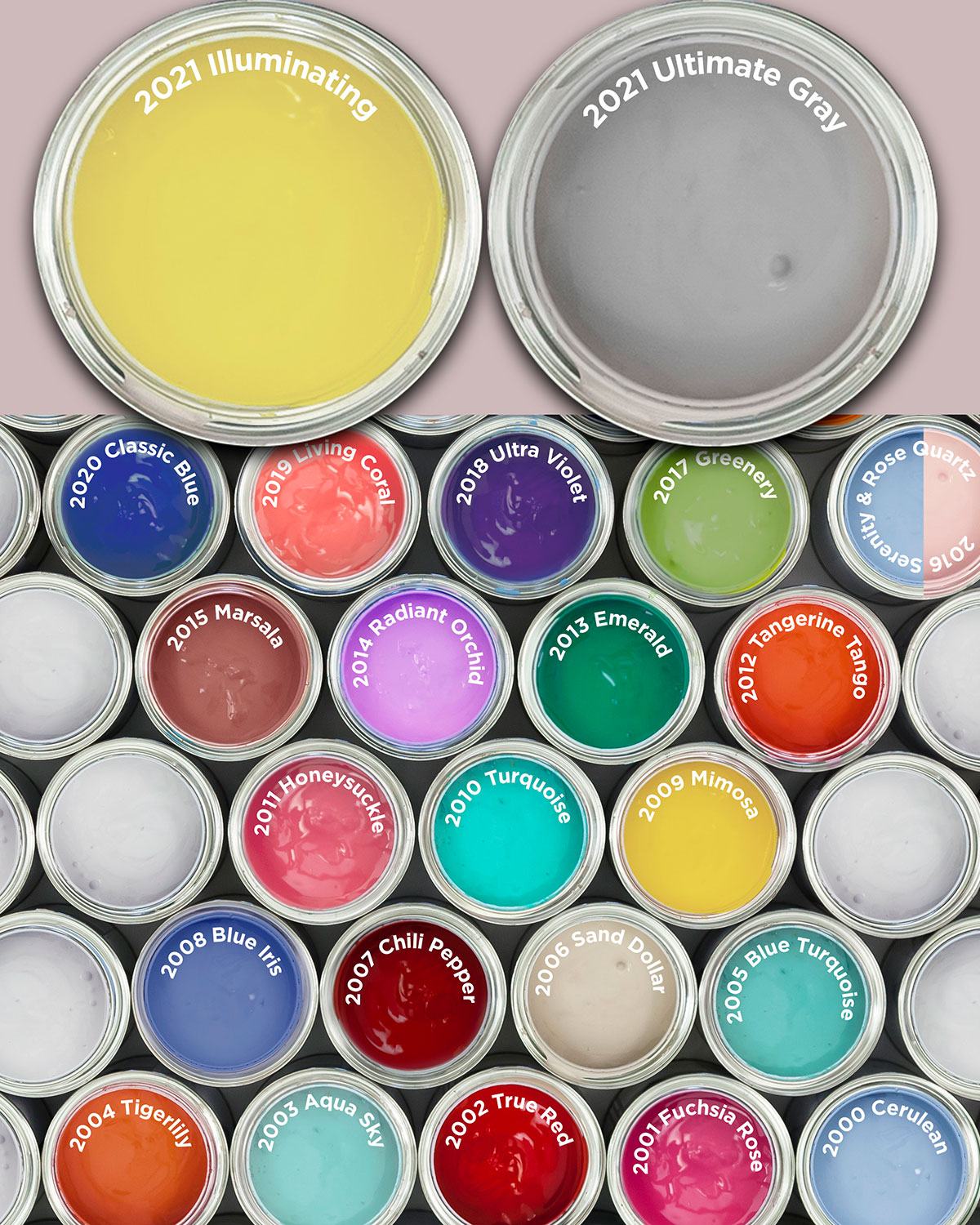 Illustration by Rachel Niebergal
- 2021 – Ultimate Gray (17-5104) and Illuminating (13-0647)
- 2020 – Classic Blue (19-4052)
- 2019 – Living Coral (16-1546)
- 2018 – Ultra Violet (18-3838)
- 2017 – Greenery (15-0343)
- 2016 – Rose Quartz (13-520) and Serenity (15-3919)
- 2015 – Marsala (18-1438)
- 2014 – Radiant Orchid (18-3224)
- 2013 – Emerald (17-5641)
- 2012 – Tangerine Tango (17-1463)
- 2011 – Honeysuckle (18-2120)
- 2010 – Turquoise (15-5519)
- 2009 – Mimosa (14-0848)
- 2008 – Blue Iris (18-3943)
- 2007 – Chili Pepper (19-1557)
- 2006 – Sand Dollar (13-1106)
- 2005 – Blue Turquoise (15-5217)
- 2004 – Tigerlily (17-1456)
- 2003 – Aqua Sky (14-4811)
- 2002 – True Red (19-1664)
- 2001 – Fuchsia Rose (17-2031)
- 2000 – Cerulean (15-4020)
Tagged: art | Calgary | Calgary Real Estate | Calgary Real Estate News | Calgary Real Estate News | colour | Colour of the Year | decor | Design | Design | Feature | history | House & Home | Inspiration


Related Articles
